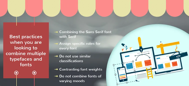
Best practices when you are looking to combine multiple typefaces and fonts
Multiple Typefaces and Fonts Necessity combinations often become a necessity when you are looking to design various websites. Not only they define the overall persona of a website, but they also encourage the visitors to invest in the products and services that the business has to offer. The typeface combinations can also be used in different types of informative websites. Combining different types of fonts and typefaces is an art and while no fixed or rigid concepts exist, it is still important to adhere to some specific best practices when you are looking to combine the fonts. Such effective combinations can always help to produce the best results when you are designing a website. Leading web design companies like SAKSHI Infoway provide some handy tips by which you can combine the various typefaces and fonts.
Combining the Sans Serif font with Serif
One of the best ways in which you can combine multiple typefaces is by using a sans serif font for the header and a serif font for the body. Plenty of websites use this combination for creating a stunning look. This means that when you use this combination, you can never go wrong. While choosing combination fonts, you should avoid choosing two typefaces which are stylistically very different as this can cause a conflict in styles. It is important to choose fonts that can complement each other effectively.
Assign specific roles for every Multiple Typefaces and Fonts Necessity
When you are looking to combine numerous fonts from multiple typefaces, it is important that you assign a particular typeface or font and then continue with it throughout the whole of the website or webpage. For instance, if you choose a particular font for article heading and one for the body, you should maintain that for the whole article. The same goes for any other type of heading or sub-heading. Keep the size of the font also intact as well.
Do not use similar classifications
Do not use typefaces from different families of typefaces but having the same classifications as they can look bad when combined. The truth is that these fonts have very different personas and do not work together. For example, do not use slab serif fonts from Clarendon Bold and Officina Serif typefaces as they are not soothing to the eyes when used together.
Contrasting font weights for Multiple Typefaces and Fonts
When you are looking to use multiple fonts in a website, it is important that you choose the size and weight of the fonts carefully so that the whole look of the website is not ruined. Adhering to this rule can help in creating a font combination that can encourage the users to look through your website. Contrasting font weights is a surefire way to lose your audience. Leading web design companies like Sakshi Infoway used this.
Do not combine fonts of varying moods
It is important for you to note that fonts and typefaces have moods and personas of their own and you should never combine them unceremoniously as they can overwhelm the visitors. Instead, only stick to combinations that can work well with each other.


Comments
Post a Comment